Reporting Experience
Overview of the Reporting Lab
This lab will provide you with foundational and advanced knowledge of Webex Contact Center Data and Analytics. You will learn about the key contact center personas and how Analyzer helps them extract key business and operational KPIs, along with actionable insights, to measure contact center efficiency, agent performance, and customer experience. The lab will guide you through the usage of the Webex Contact Center Analyzer, which serves as the main Contact Center Reporting application. You will gain an understanding of utilizing stock reports and dashboards, personalizing your reporting by creating custom reports and the available options when it comes to extracting your data.
Objectives
This Lab has been split into four parts.
-
First part of this Lab introduces you to the current Analyzer User Interface as well as the New Analyzer User Interface (Analyzer UX Refresh).
Note: Important to point out that the New Analyzer User Interface is in Early Access phase and has access only to Historical Stock Reports.
- In the second part we will look how key Contact Center personas (Administrators, Supervisors and Contact Center Analysts) can use Analyzer to extract some key Contact Center KPIs and actionable insights around Contact Center Operational Performance, Customer Experience and Agent Performance using the various Stock reports and dashboards.
- In the third part we will walk through how we can create custom reports to extract key Contact Center data insights.
- Last chapter covers key data and reporting capabilities like the export of reporting data, report scheduling and the available Data APIs to extract the data.
Table of Contents
| Topic | Type | Dificulty | Time |
|---|---|---|---|
| Pre-Requisites | Activity | EASY | 5 min |
| Analyzer and Desktop Login Process | Activity | EASY | 5 min |
| Part 1: Webex Contact Center Analyzer User Interface | Exploration | EASY | 15 min |
| 1.1: Analyzer User Interface | Exploration | EASY | |
| 1.2: NEW Analyzer User Interface | Activity | EASY | |
| Part 2: Contact Center Insights with New Analyzer Stock reports | Activity | EASY | 15 min |
| 2.1: High-level Contact Center Performance and Usage insights | Activity | EASY | |
| 2.2: Customer Experience and Queue Performance | Activity | INTERMEDIATE | |
| Part 3: Contact Center Insights with Analyzer custom reports | Activity | INTERMEDIATE | 15 min |
| 3.1: Create Custom Realtime Agent Report | Activity | INTERMEDIATE | |
| Part 4: (BONUS) Data extraction and scheduling Capabilities | Activity | EASY | 20 min |
| 4.1: Export Data as Excel or CSV | Activity | EASY | |
| 4.2: Visualization Scheduler | Activity | EASY | |
| 4.3: Search APIs | Activity | INTERMEDIATE |
Pre-Requisites
Create Chrome Profiles
-
For the lab, create new Chrome profiles so that you can login the Administrators, Agents and Supervisors using the same Browser.
- Select
Profileson Chrome - Select
Add Profile - Select
continue without an account - Give it a name .i.e
Admin - Click
done - Create 2 more profiles for
SupervisorandAgent
- Select
- Ensure that you have received your tenant login credentials (Administrator, Supervisor and Agent) from the Lab proctors.
- Make sure you are able to login into Admin Portal & Analyzer.
- In this Lab, Part 1 and 2 already have historical data created to capture the key insights, hence no need to login Agent or make calls to complete those parts.
- In Part 3, we will look into some Realtime data insights for which make sure you are logged-in with your Supervisor-Agent or Agent.
You Will Need
-
One additional device (like your personal phone) to test inbound calls to the Webex Contact Center. You can use your cell phone for this purpose.
- Administrator credentials for the Control Hub: admin.webex.com.
- Agent Login Credentials for the Agent Desktop: desktop.wxcc-us1.cisco.com.
-
The items listed below have been pre-configured for you:
- Agent and Supervisor user accounts are configured and ready for login.
- You can access the Agent Desktop via the URL: https://desktop.wxcc-us1.cisco.com.
- As an agent, you’re associated with two teams —designated by your Attendee ID— as “Team1” and “Team2”.
Example:
If your attendee ID is 100:
100_Team1
100_Team2
-
Agents will use browsers for voice calls using WebRTC (Web Real-time Communication) endpoints. Additionally, Webex Calling extensions have been assigned to users (both agents and supervisors) to facilitate alternate device experiences. Webex Contact Center agents and supervisors can opt for any mix of these devices, encompassing PSTN endpoints and mobile phones.
-
A preset inbound Voice flow is available for test calls.
Lab Configuration
Please submit the form below with your Attendee ID in 3 digits long format (e.g. if your attendee ID is 51, please enter 051). All configuration items in the lab guide will be renamed with that prefix.
The following Administration entities have been configured for you via Webex Control Hub.
Please note, that to proceed to the next section, you will need to use the accounts shown below.
| Entity | Name |
|---|---|
| Agent 1 | wxcclabs+agent_ID |
| Supervisor 1 | wxcclabs+supvr_ID |
| Administrator | wxcclabs+admin_ID |
Analyzer Login Process
- Make sure you are able to login into Administrator Portal (admin.webex.com using your Supervisor credentials.
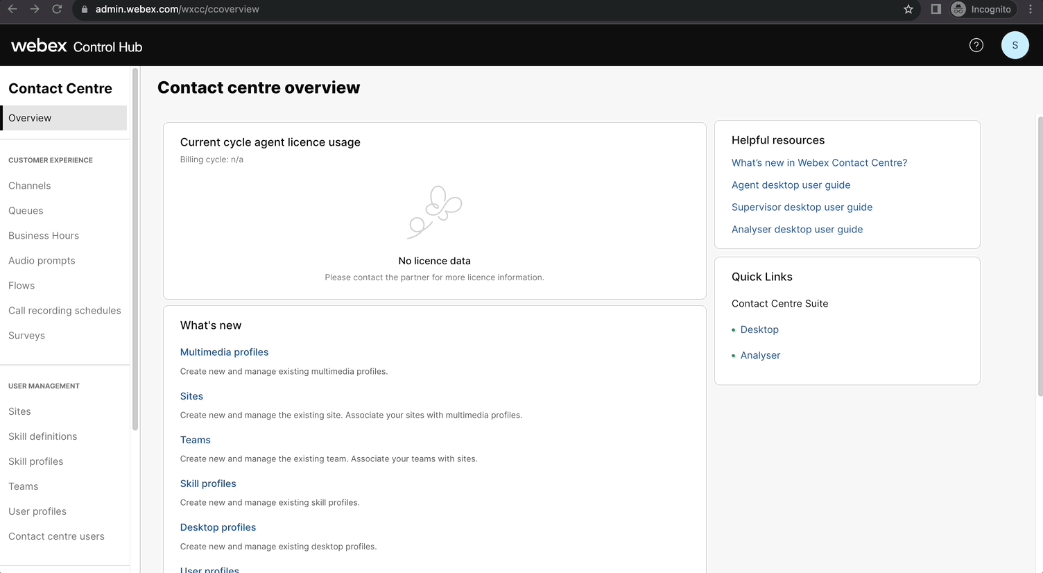
- Once logged-in, go to
Quick Linkson the right and click onAnalyzer.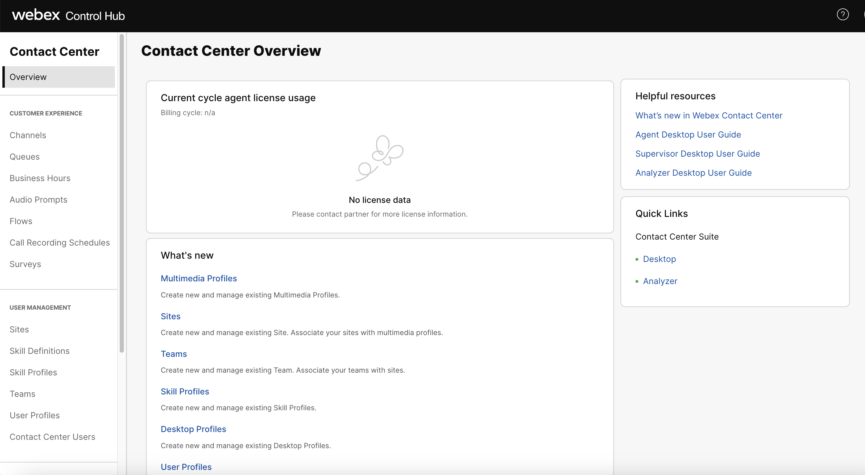
- For Part 3 of the Lab, login as an Supervisor-agent or Agent :
Note: If you are already logged-in as an Agent as part of other Labs, no action is required.
You have 2 options to login as an Agent:
- Supervisor credentials with Role as
Supervisor and Agent - Using your Agent Credentials
Login As Supervisor-Agent
Note: Currently supervisors can not login via Desktop/WebRTC. If you want to test a login with WebRTC, make sure to sign in as an agent, as per the steps on the next chapter.
| User Role | User email | Endpoint |
|---|---|---|
| Supervisor | wxcclabs+supvr_ |
Webex App/Extension |
- Login with Supervisor Credentials admin.webex.com.
- Go to
Quick Links–> Click onDesktop. - Select the Role as :
Supervisor and Agent. - Enter the Dialed number provided (if it is not pre-filled).
- Team should be pre-populated.
- Click
Submit.
Login in the Webex app for PC or Mac
In this lab, we can use the Webex app for PC or Mac to login to the Desktop with the supervisor account.
- Download Link: https://www.webex.com/downloads.html
-
Install the application on your PC/Mac.
-
Open Webex app and сlick Sign In. Enter the provided supervisor credentials.
Agent Desktop Login
| User Role | User email | Endpoint |
|---|---|---|
| Agent | wxcclabs+agent_ |
WebRTC/Desktop |
Note: To log in to the agent desktop, use either a different web browser or a new incognito web page. This will prevent the browser caching issues with admin and agent credentials.
-
Navigate to Desktop in the chrome browser with the incognito mode.
-
Enter the agent’s email ID.
-
Enter the Password for the appropriate username.
-
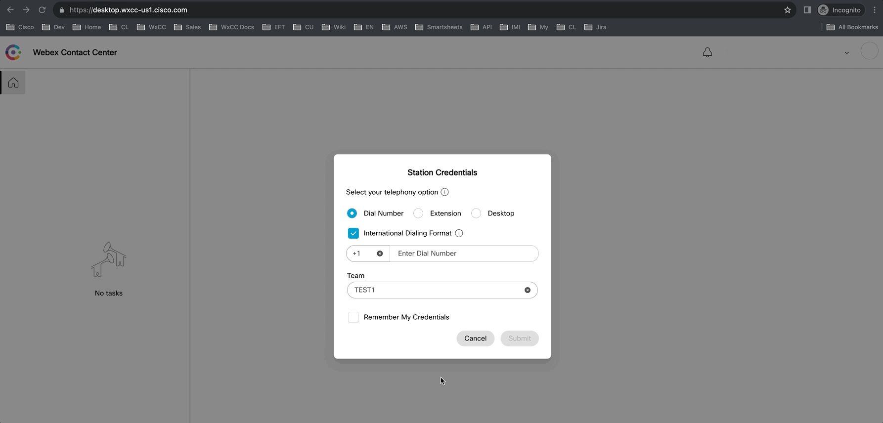
In the Station Credentials pane, select “Desktop”.
-
Select the team
Your_Attendee_ID _Team1. -
Click the Submit button. The browser may ask you to confirm the use the microphone from the browser.
-
Make sure that you are successfully logged in to the Agent Desktop.
Part 1: Webex Contact Center Analyzer User Interface
1.1 Analyzer User Interface
This lab is designed to give you basic understanding of Analyzer, user interface features as well as the default dashboards available in the Admin Portal. In the following exercises, the goal is the familiarization with the product, interfaces and terminology.
-
At this point, you should be already logged-in to Analyzer. If not, use the steps above to login to Analyzer.
-
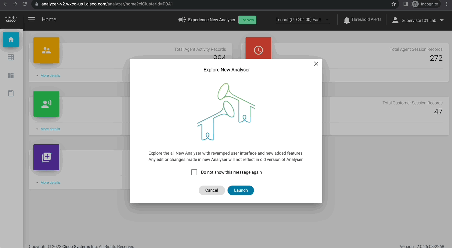
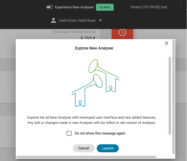
As you login, you may see this pop-up prompting to “Explore New Analyser”. \({\color{red}DO\space NOT\space LAUNCH\space it\space at\space this\space time\space and\space Click\space Cancel.}\)
-
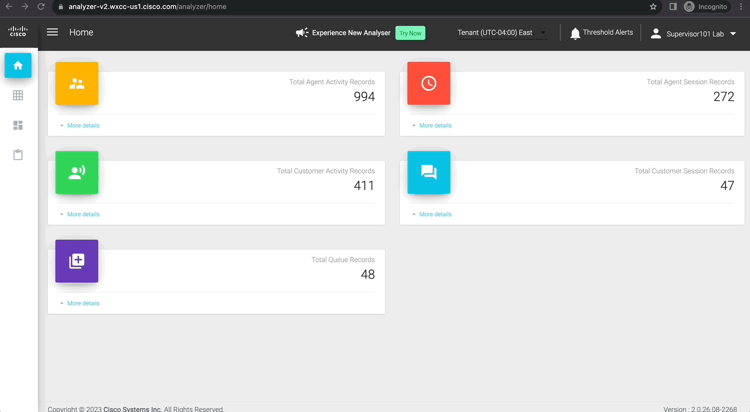
Navigate around the home screen to learn the different features available on this screen.
- Make a note of the sessions count for the four data repositories:
- Customer Session
- Customer Activity
- Agent Session
- Agent Activity
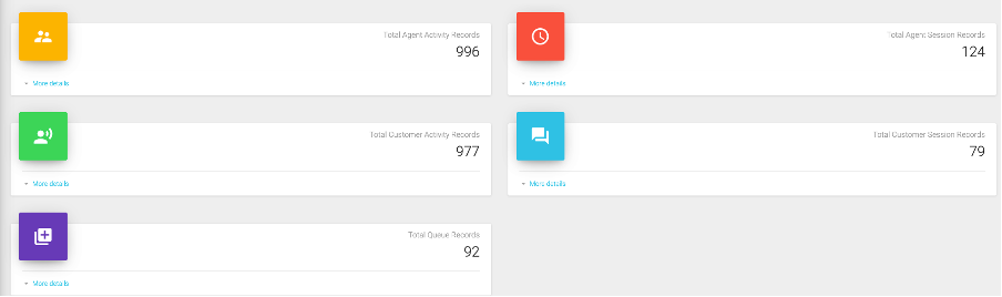
- Make a note of the sessions count for the four data repositories:
-
Click on the Visualizations tab on the left.

-
On the top in Search field, search for any key word like
agent:- Click on Agent Realtime report and note down the path for this report.
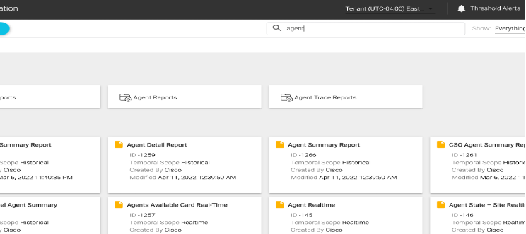
- Searched items can be further filtered to show Visualizations or Folders from the
Showdropdown menu.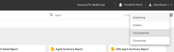
- Click on Agent Realtime report and note down the path for this report.
-
Then, navigate to the following path:

Click to change the view to
 Listview.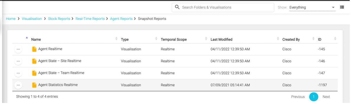
- Here you can sort the reports based on a specific header by clicking on the header.
- Notice the Temporal Scope, which can be either Realtime, Compound or Historical.
- ID is unique for every report and a report can also be searched by its
IDbesides the name.
-
Click the
 icon next to the report and then click on Details.
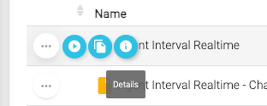
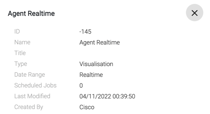
- Make a note of the Date Range and Scheduled Jobs.
- Try the same for any Historical stock report.
-
On the top, click on your username and then Help to open the help manual for Analyzer.
- This provides you with an online version of the Analyzer User Guide, a great document that provides information about all the available stock reports, variables as well as functionalities of Analyzer.
-
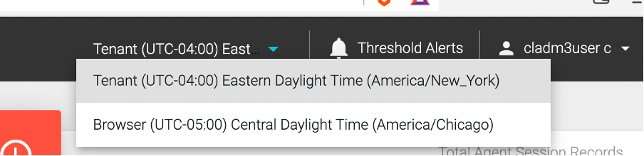
Click on Tenant Time zone option on the header. Set it to the time-zone in which you want to Run Visualizations (You have two possible options: Tenant or Browser).
1.2 NEW Analyzer User Interface
The New Webex Contact Center Analyzer (Analyzer UX Refresh) offers an enhanced and intuitive user interface that enables you to manage stock historical dashboards. It provides faster, more efficient, and focused views of historical analytics for Webex Contact Center, enhancing the integrated experience. The stock historical dashboards offer ready-to-use metrics, allowing you to generate metrics related to entry points, queues, teams, contacts, and agents for strategic decision-making.
Note: The New Analyzer today does not currently provide custom dashboards. To access custom dashboards, you can use the existing Analyzer. Extending custom reporting support and adding real-time reports to New Analyzer UX is in our roadmap.
-
Login into the New Analyzer:
- Click
Try Nowon the current Analyzer page.
- New Analyzer will be cross-launched.
- It may ask you to enter your supervisor username again.
- You can also navigate between the new Analyzer and existing Analyzer using the browser tabs.
You can see a new home page with centralized dashboards and reports. You’ll see a new search bar to search through the various dashboards.
- Click
-
Report Tabs: Reports and Dashboards are grouped under following
Tabs:- All: Lists all the dashboards and reports.
- Recent: Lists the most recent dashboards that you viewed.
- Favorite: Lists the dashboards that you have marked as favorite.
- Stock: Lists the predefined stock historical dashboards provided by Cisco.
Click on each Tab and make a note of the number of reports in each Tab.

-
Click on
staricon next to theAbandoned Call Detail Activity Reportto mark it as your Favorite.
This allows you to access your favorite dashboards easily under the dedicated
Favoritetab. -
Next, view the
Agent Call Summary Report, for this double-click on the dashboard name or select View under the Actions tab.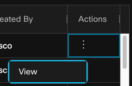
-
Next, review again the count of the reports in each tab and also if your recently executed report and favorite marked reports are visible under the respective tabs.
-
Use the
Sort Bydrop-down menu to filter stock dashboards by options such as Name, Created By, and Last Edited By. This enables easy organization and navigation based on your preferred sorting criteria.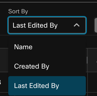
-
Switch to Card View by cliking
 .
.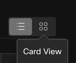
The List View is the default view and allows easy navigation and quick access to the entire collection of stock dashboards.
The Card View provides a compact and visual representation of the stock dashboards, displaying snapshots of 15 dashboards in a single view.
-
Next, switch back to the List view and make a note of the
Labelscolumn.We’ve replaced folder-based navigation with
labels. The predefined labels help you find and sort stock historical dashboards. The labels are color-coded to enhance the user experience. You can search for dashboards using labels.- All stock reports by default are marked with label
Stock.
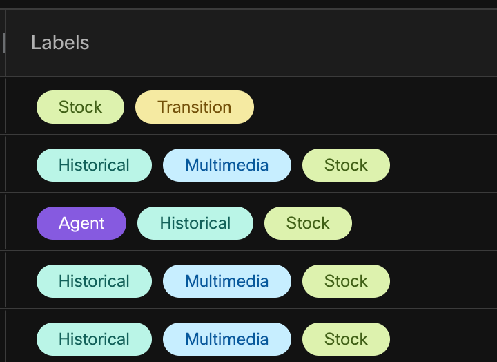
- All stock reports by default are marked with label
-
Next, use the search box to find a stock dashboard using different criteria or comma separated words. For this example, search the word
transition.
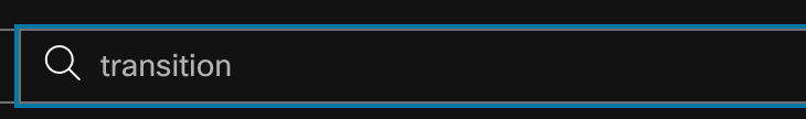
This would list all the Transition reports, which are built for easy reporting insights for customers migrated from UCCX but also useful for any customer.
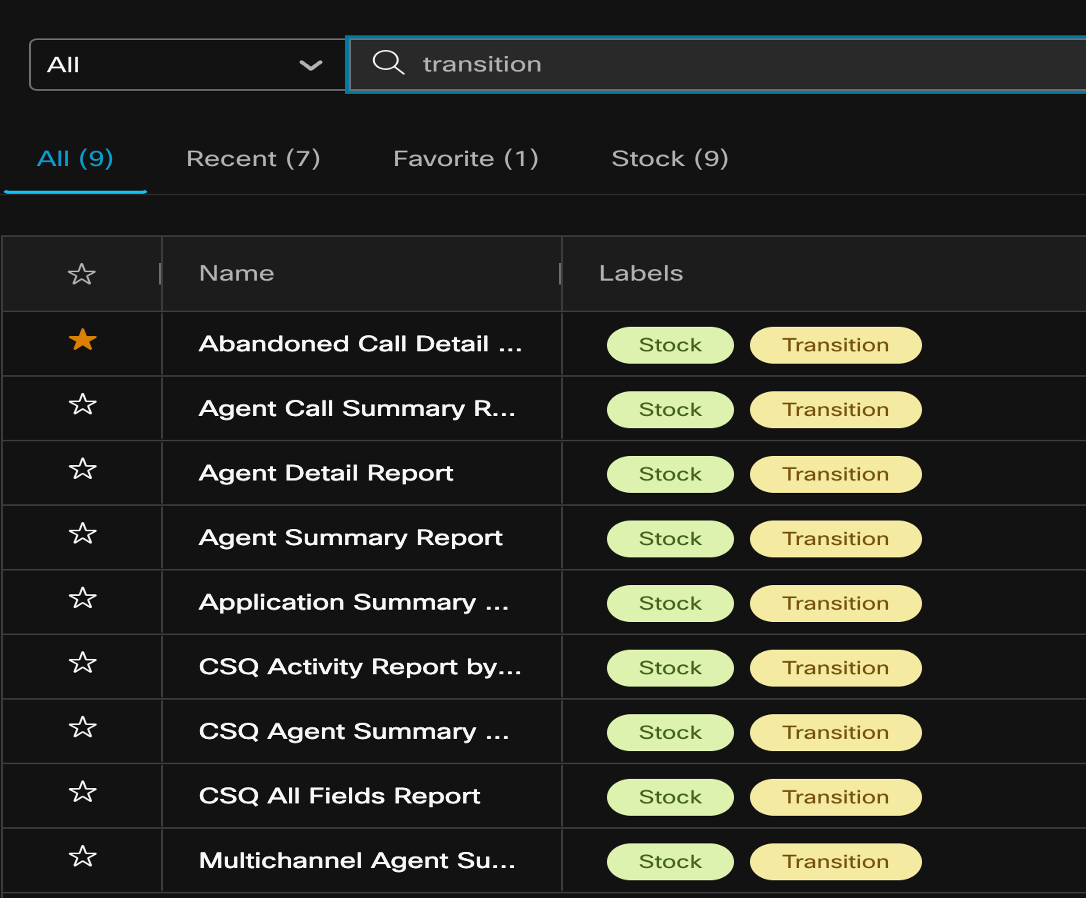
Customize your search selecting criteria such as Name, Labels, Created By, or Last Edited By from the drop-down menu.
-
Next, click on the user profile icon on the top right of the user interface provides user information. The time zone settings and dark mode options are available in the user profile settings.
-
Time Zone
By default, the new Analyzer shows the tenant time zone. You can update the browser settings if necessary. Scheduled jobs always run in the tenant time zone.
-
Dark Mode
You have the option to switch between dark and light screen modes to suit your viewing experience.
-
-
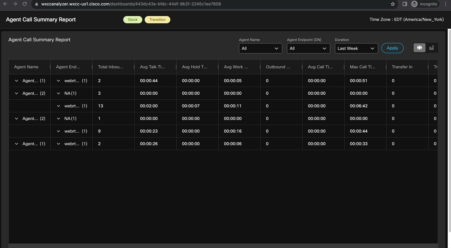
Next, let’s take a look at key functions for a stock report. Go to the
Agent Call Summary Report, which you viewed in step #3. -
By default, data is displayed in
Table ViewforLast week. Change it toThis monthand click Apply. What you see here is the Agent summary data for all the agents for this month.Note: In the Table view of a dashboard, Analyzer supports a maximum of 100 columns and up to 100,000 rows.
-
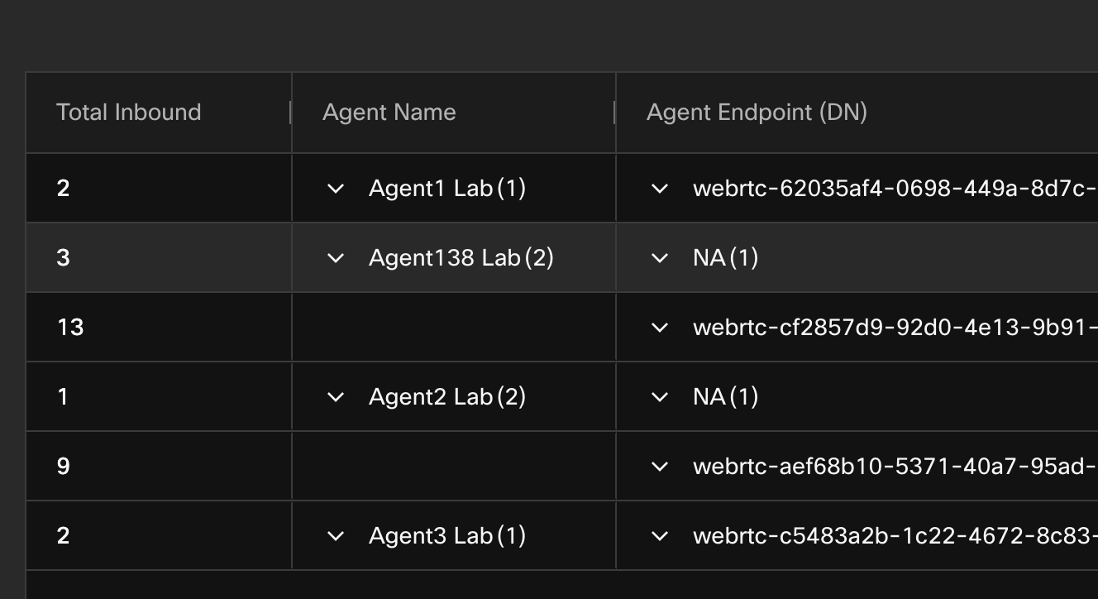
Click on
Agent Endpoint (DN)filter and make a note of device types used by the users (Agent and Supervisors). You would notice a mix of Dial numbers and WebRTC devices. -
Pin Column
You can pin columns or move columns of a dashboard to the right and left of the table based on your requirements.
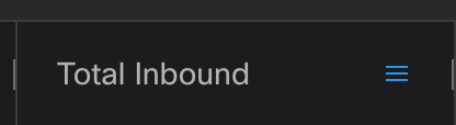
- On the dashboard, on the
Total Onboundcolumn, click the hamburger menu next to the column header.
- Go to
Pin Columnand clickPin Left.
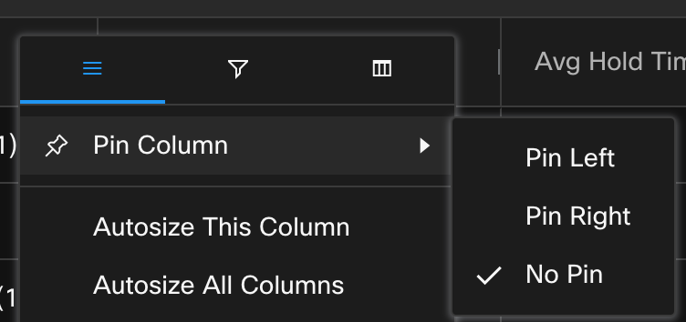
This would move the Total Inbound column to the left of the table.
- On the dashboard, on the
-
Autosize Column
Next, let’s autosize all the columns as data in some columns is not clearly visible because of last textual size. To do so: On the dashboard column, click the hamburger menu next to the column header.
- Click
Autosize This Column. - For all columns, click
Autosize All Columns.
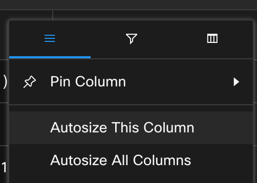
This would allow you to see all the data points clearly.
- Click
-
Advanced Filtering
We already saw how you can use predefined filters on the reports. Beyond that, you can also filter the data data for other columns in the reports. In the current
Agent Call summaryreport, let’s filter the data to identify any agents which handled low number of calls.For this, click on Hamburger sign
 next to the
 Total InboundColumn –> Click on the Filter option and select “0” and “1”. Data will be updated immediately (No need to click Apply).
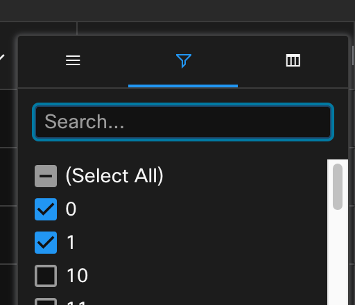
-
Column View
You can customize the visibility of columns in the table. On the dashboard column, click the hamburger menu next to the column header. Click on Column view icon
 and uncheck all
 Timefield columns to exclude them and have a simpler count only view.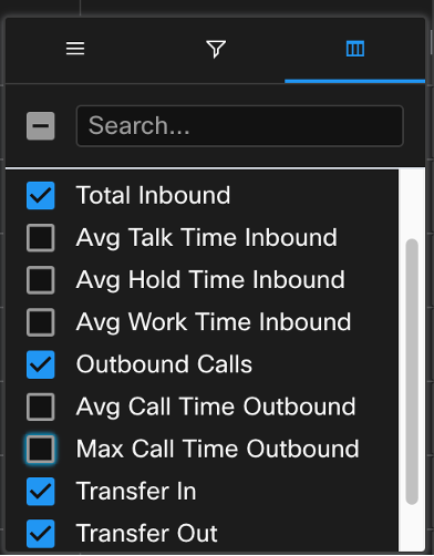
-
Switch the view of the report from
TabletoChartby clicking on top right corner of the report.
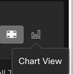
You would notice a graphical view of the data for the number of
Total Inbound Contacteach agent handled during this month along with a trend line.
Trend Line
In Chart view, the new Analyzer introduces Trend Line, which is a visual representation of trends with data points. When viewing a dashboard, the presence of a trend line allows users to quickly identify and understand the underlying trend or pattern within the data.
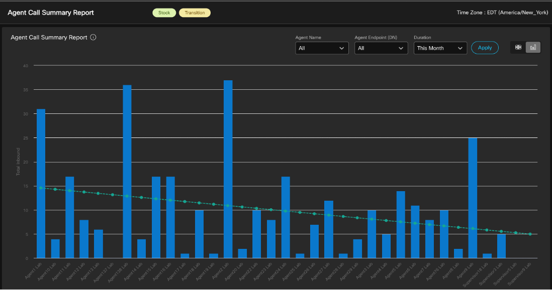
Similarly you can try filter the data based on Agent Name and Agent Endpoint (DN).
Congratulations, you have completed this lab! You can continue with the next one.
Part 2: Contact Center Insights with New Analyzer Stock reports
In this section, we will delve into how various personas within a contact center can leverage the Webex Contact Center Analyzer to capture Key Performance Indicators (KPIs) and gain insights that can measure and enhance customer experience, agent performance, and overall business outcomes. We will explore some of the pre-built stock reports with New Analyzer Interface, which can help you gather these key actionable insights from day one.
2.1 High-level Contact Center Performance and Usage Insights
Persona: CC Administrator, Supervisors, CC Manager, Leadership
Preferred View Type: Chart, Trending
Business Use Case: Contact centre administrators play a crucial role in managing and optimizing contact centre operations. To effectively monitor and analyse the performance of the contact centre, it is essential for administrators to capture and track high-level contact centre state and usage data. This data provides valuable insights into various aspects, such as agent productivity, call volumes, customer satisfaction, and system performance. By capturing this information, administrators can make informed decisions, identify areas for improvement, and ensure efficient contact centre operations.
A. Expected Insights and Actions
Monthly trending of total inbound and outbound contacts over this year. Secondly, the usage of different communication channels, such as phone calls, emails, live chat, and social media interactions.
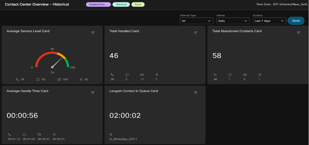
Contact Center Overview – Historical
Search for the label Contact Center Overview and double click on the Contact Center Overview – Historical dashboard.
- Make a note of the following cards: Average Service Level, Total Handled, Total Abandoned Contacts, Average Handle Time.
- Switch the Duration to
This Yearand notice the change into these KPIs. - Select Channel Type and opt for digital channels only: Email, Chat and Social to observe the updated KPI’s.
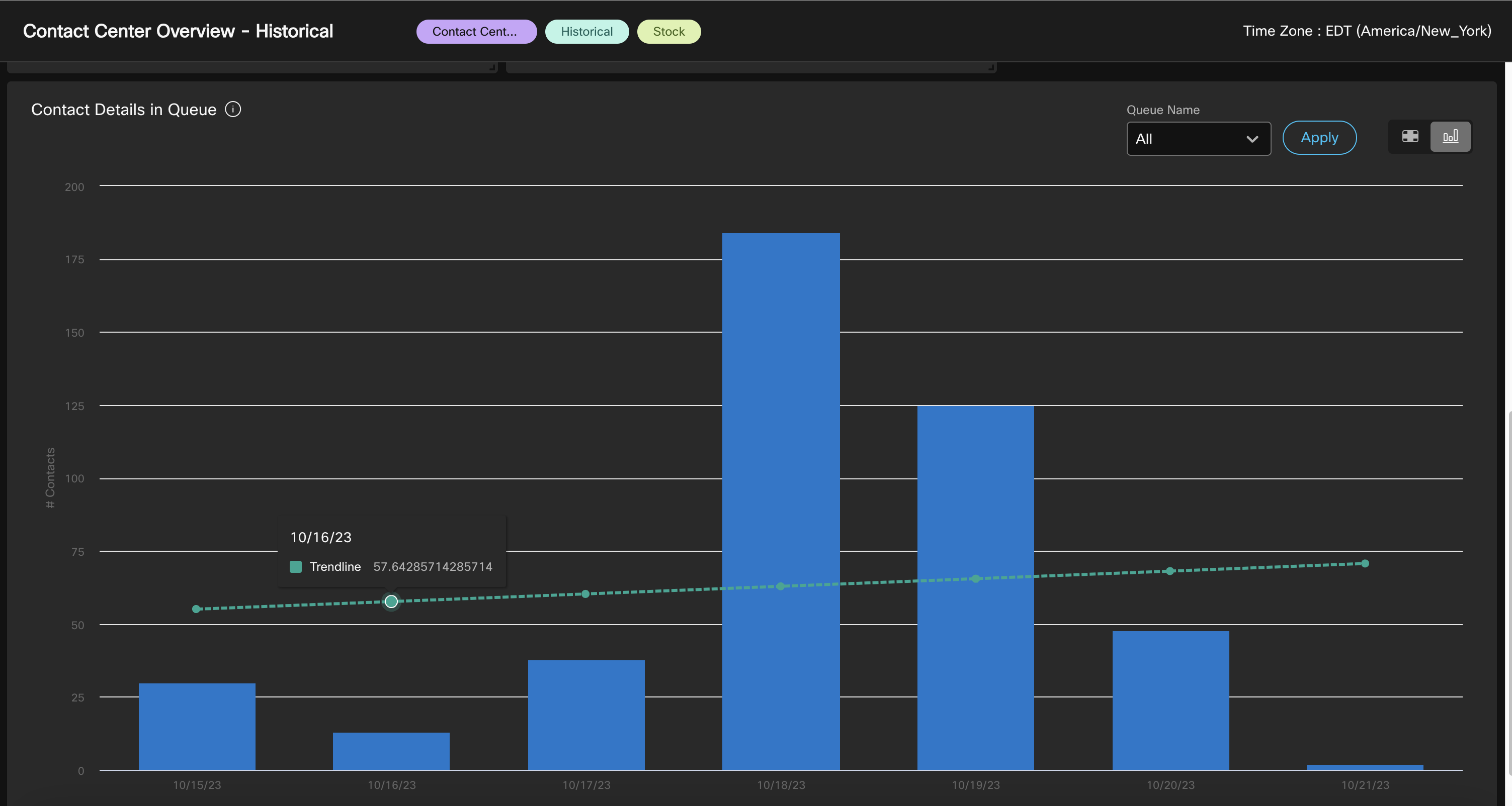
- Scroll Down the dashboard to the review the
Contact Details in QueueReport. - On right upper corner, change
Contact Details in Queuereport to Chart View. - Observe the historical Queue volume and trending across last 7 days.
Field Description
Contact Center Overview – Historical dashboard displays displays contact statistics for a specified duration and time interval. Users can filter data using drop-down lists. The available information includes:
- Average Service Level: Shows the percentage of contacts handled within the set service level.
- Total Contacts Handled: Displays the total number of contacts handled across various communication channels.
- Total Contacts Abandoned: Shows the total number of contacts that were abandoned.
- Average Handled Time: Indicates the average time taken to handle a contact.
- Longest Contact in Queue: Displays the waiting time for the contact with the longest queue time.
- Contact Details in Queue: Shows the details of contacts (voice, email, social, and chat)
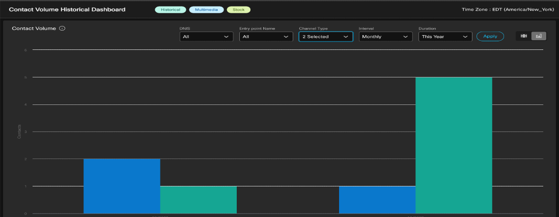
Contact Volume Historical Dashboard
- Search for
Contact Volume Historical Dashboardand execute it. - You would notice all the dialed number and entry points in the contact centre across all the channels and the respective contact volume.
- Switch to the Chart view.
- Change duration to
This Year. - Update Interval to
Monthly, clickApply. - This provides you a trending view of contact volume for the year and comparison on monthly basis.
- Update Channel Type filter to select
TelephonyandChat. Observe the comparison data between these channels over the period of time.
Field Description
The parameters in this dashboard include DNIS (Dialed Number), Entry Point Name, Interval, Channel Type, and Contacts.
- DNIS is a service from the phone company delivering a number indicating the digits dialed by the caller. It’s used as a row segment, but it doesn’t appear for chat contacts.
- The Entry Point Name is the name of a particular entry point, also used as a row segment.
- Interval refers to a time period, specifically the last 7 days in this context.
- Channel Type denotes the media type of contact, like telephony, email, or chat, and it’s used as a row segment.
- Finally, Contacts is a parameter that refers to the count of contact session IDs, serving as a unique identifier for each contact.
Action: Administrators analyse this data to assess channel preferences, allocate resources effectively, and identify opportunities for improving customer service across different channels.
B. Expected Insights and Actions
Trend and detailed insight of Agent performance metrics like Max Connected Duration and Avg Connected Duration across Agent Teams as well as Agent level break down optionally. This helps to identify any need of process improvements or additional agent training.
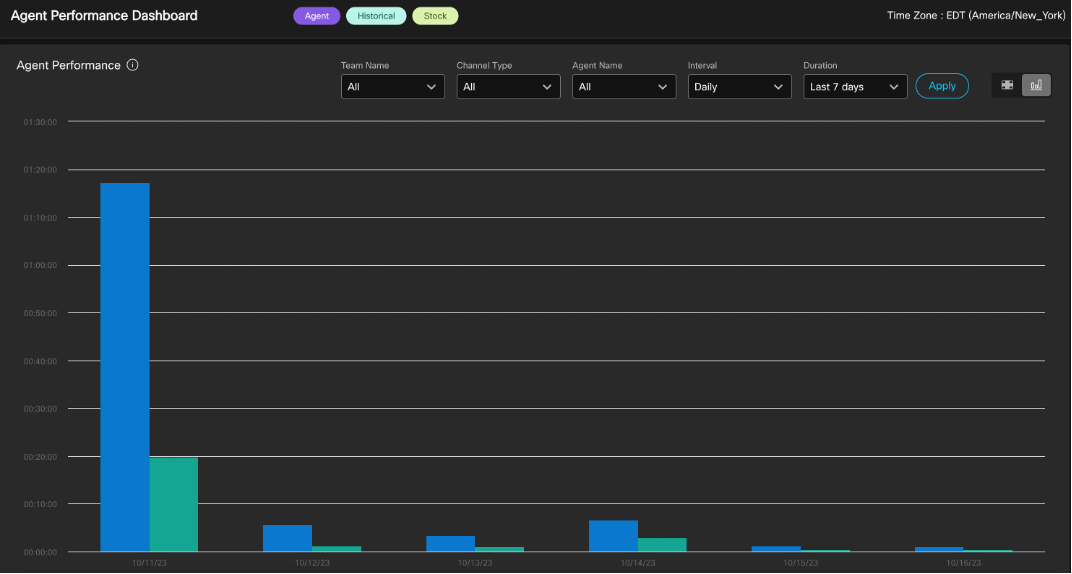
Agent Performance Dashboard
- Search for
performancein the search bar. Look forAgent Performance Dashboardand double click to view it. - By default, you will see a Chart view of the monthly data of
Max connected durationandAverage connected Durationwith weekly interval. - You can try to switch the Duration and Interval to look for the data for longer or shorter period and notice the trend.
- Switch to the Table View
 and you will notice much more detailed data insights into each team and agent level.
 - Further filtering can be done based on Team, Channel and Agent Name, to gather insights around specific agent group.
Action: Look if the max connected duration is consistently high, it may indicate a need for process improvements or additional agent training. If the average connected duration is longer than desired, it may indicate the need to streamline processes, provide agents with additional resources or tools, or optimize call handling techniques. On the other hand, if the average connected duration is too short, it may indicate rushed interactions or missed opportunities for upselling or cross-selling.
2.2 Customer Experience and Queue Performance
Persona: CC Supervisors, CC Manager, Business Analyst
Preferred View Type: Table
Business Use-Case: Capturing and analysing customer experience analytics in a contact centre is essential for businesses to understand and improve customer satisfaction levels. By gathering key data insights across every stage of the Contact including:
- IVR
- Self-Service / Virtual Agent
- Queue performance including Transfer Rate after connection to an Agent
- Queue Opt-out / Callback
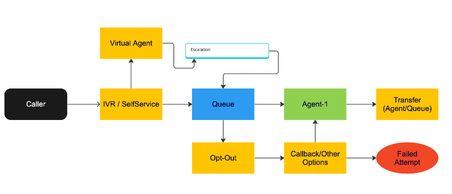
A. Expected Insights and Actions:
Understanding the virtual agent’s resolution rate, and escalation rate to the Queue.
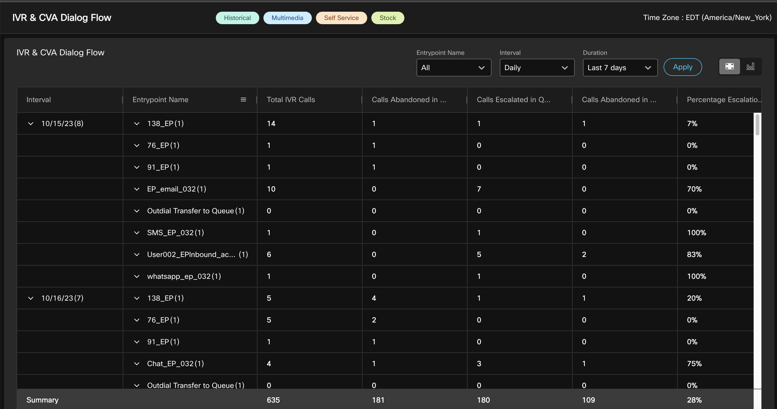
To extract expected insights we can leverage stock report IVR & CVA Dialog Flow Report.
IVR & CVA Dialog Flow Report
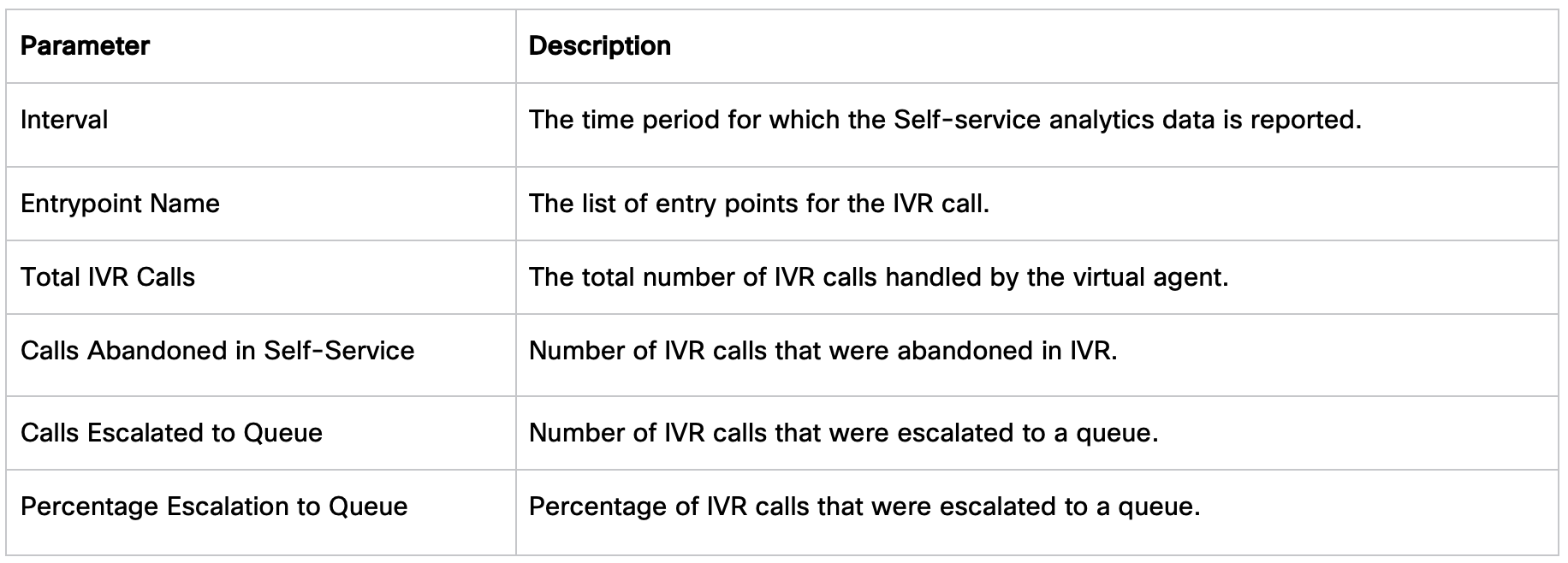
This report displays the Self-service operational metrics. Which consist of:
- The total number of IVR calls handled by the virtual agent.
- Number of abandoned calls in Self-service.
- Number of IVR calls that were escalated to a queue.
- Percentage of IVR calls that were escalated to a queue.
Steps:
- Search for label
selfservice. - Look for
IVR & CVA Dialog flowReport –> Double click to view it.
Actions: Refining the virtual agent’s responses where escalation rate to the Queue is higher, training them on new issues.
B. Expected Insights and Actions
Supervisor looking for key performance metrics for their line of business (Queue) such as Percentage Handled, Abandonment Rate, Avg Abandoned Time and Service Level.
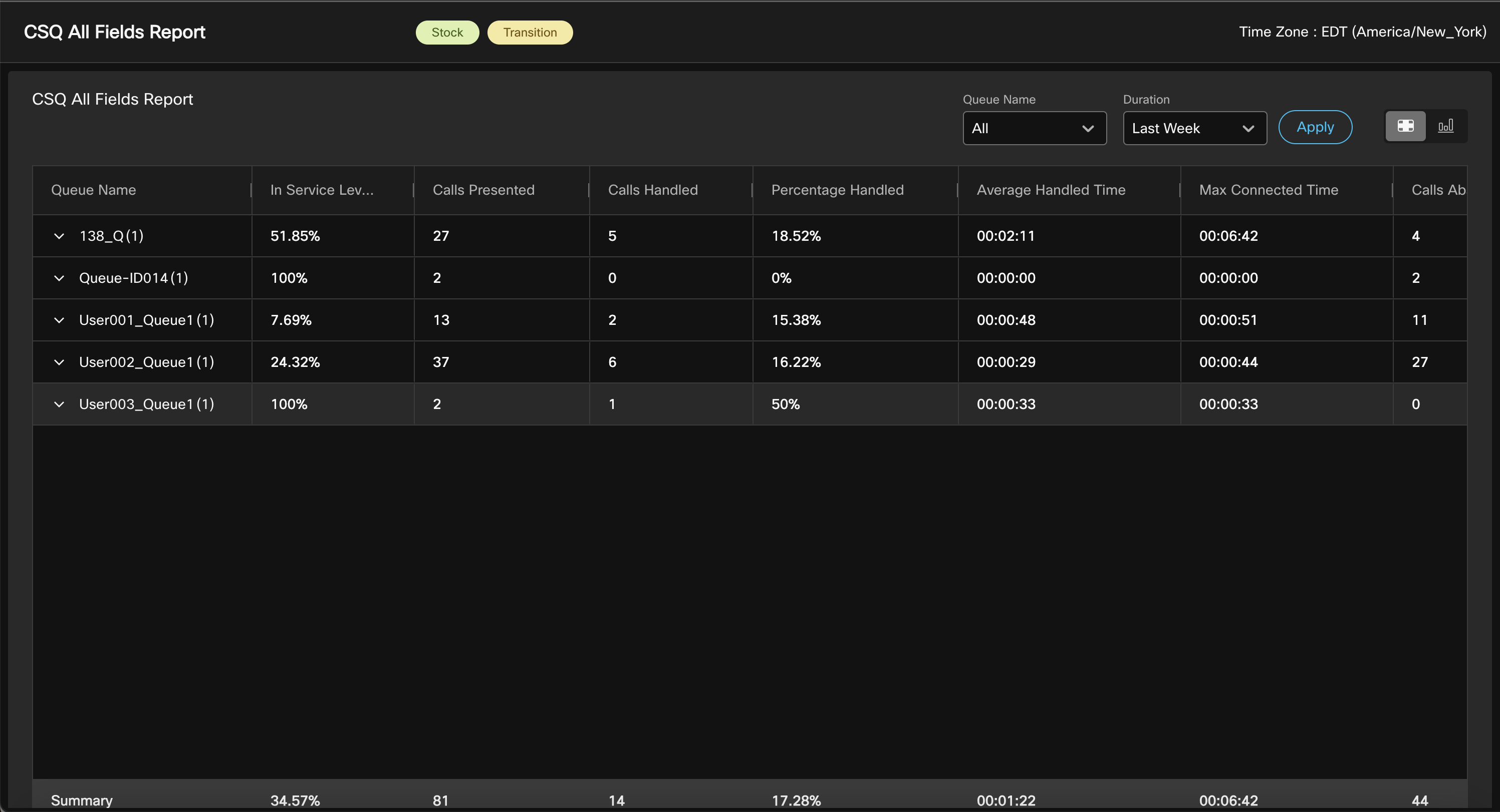
CSQ All Fields Report
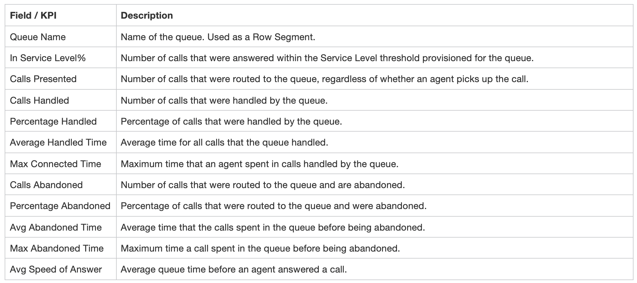
The CSQ All Fields Report presents the queue-related data such as call statistics, service level, and key fields like Average Queue Time, Average Speed of Answer, Calls Handled, and Calls Abandoned under service level. This report combines the fields of all queue-related reports.
This report is also part of Transitions reports built in Webex Contact Center to deliver the look and feel of Key Contact Center Express (UCCX) reports to help customers who transitions to Cloud Webex Contact Center.
Steps:
- Search for Label
Transition. - Look for
CSQ ALL Fields Reportand double click it to view.
Actions: Adjusting staffing levels and/or call routing improvements to manage peak times and low service level. Implement callback options to reduce wait times and abandonment rate.
C. Expected Insights and Actions
Offering the callback option to customers when they are in IVR or waiting in the Queue is one of the most efficient ways to improve the customer experience. Capture the callback success rate and reasons for failure.
Callback Report
The contact center customer can opt to receive a callback from an agent while in IVR or waiting in a queue. The courtesy callback flow is configured by the flow developer.
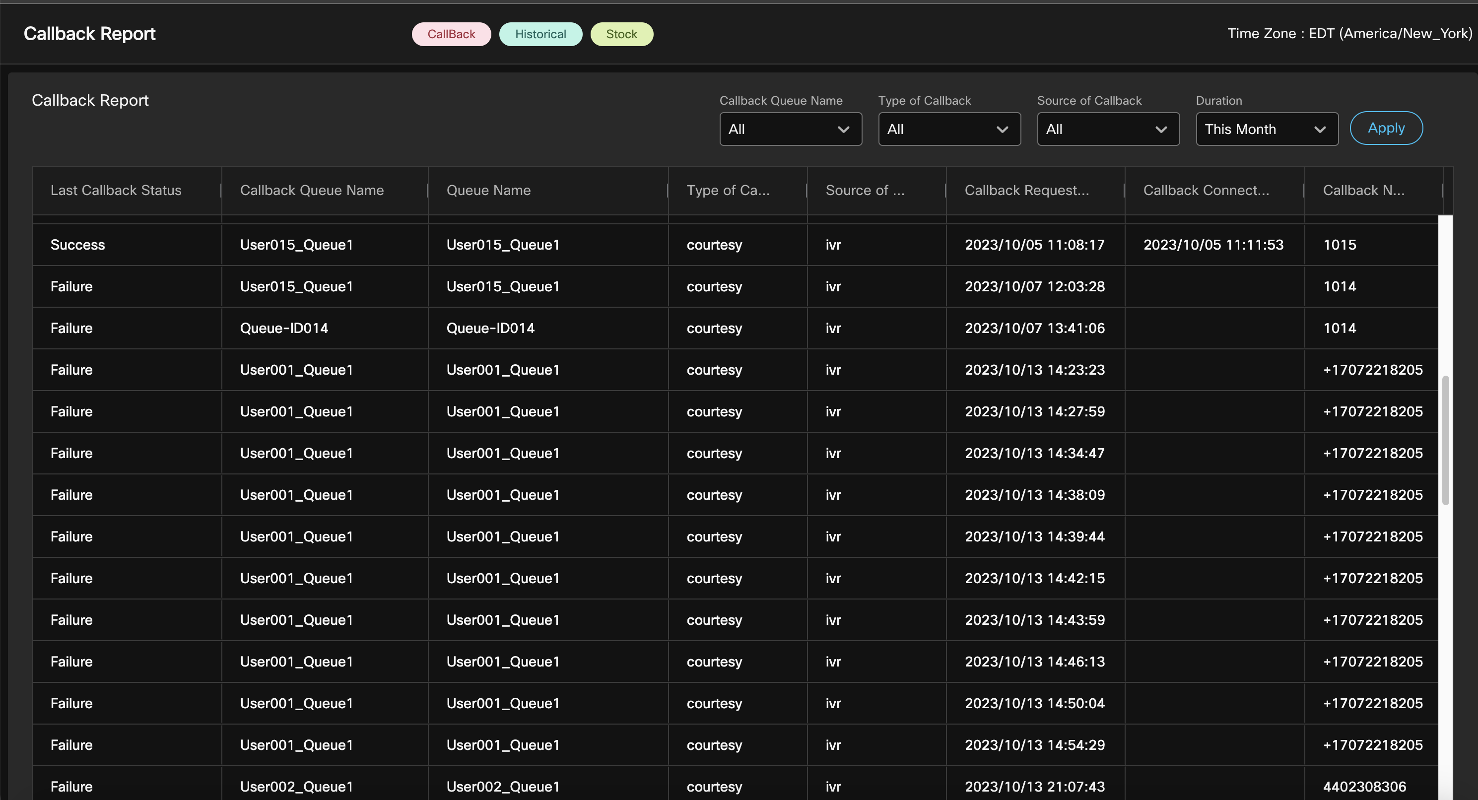
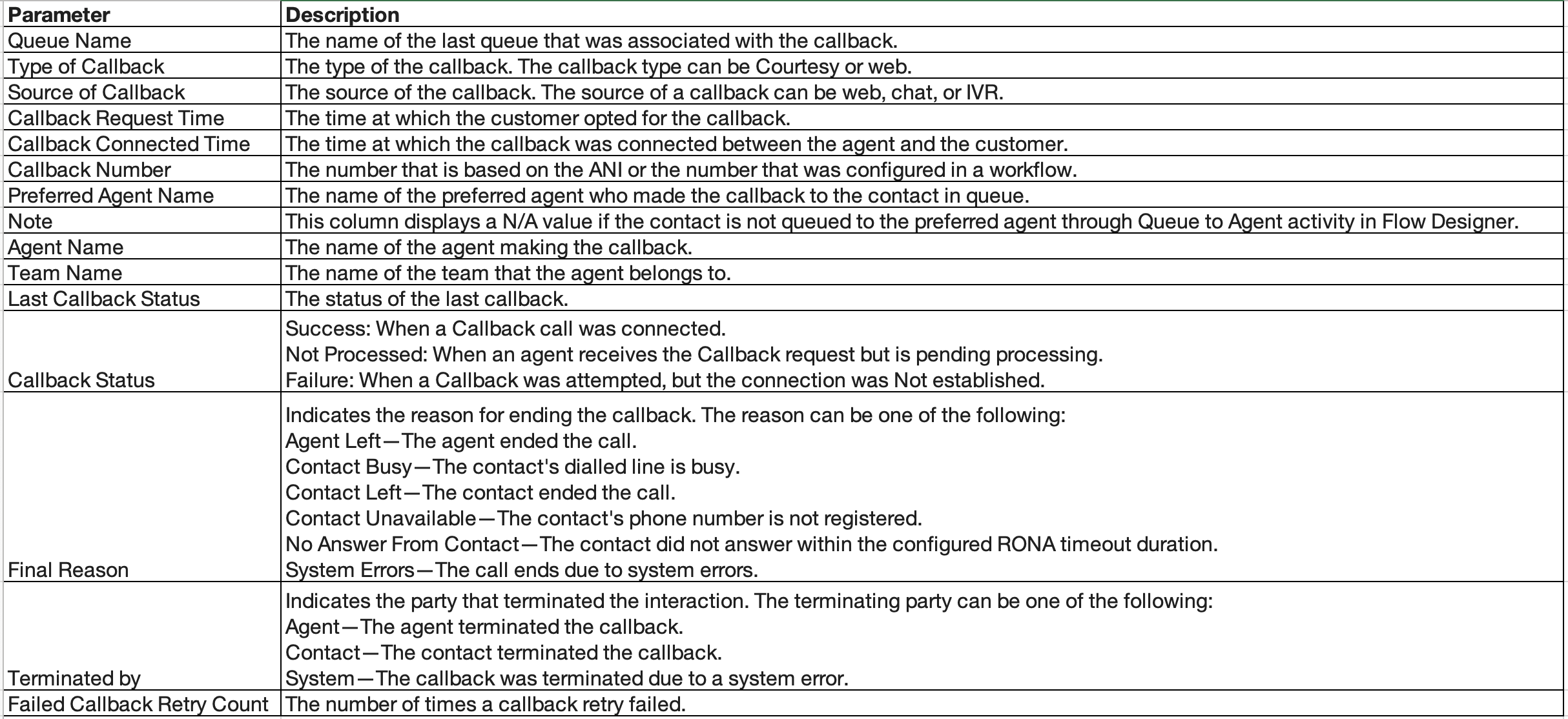
Actions: For low Callback success rate review we would check on the Final Reason. One of the prime reasons for an unsuccessful callback request is that customers aren’t reachable or busy at callback time. Explore if offering the Callback Retry attempt (CallbackFailed) for the callback would help improving the success rate and tweak it based on further review.
Congratulations, you have completed this lab! You can continue with the next one.
Part 3: Contact Center Insights with Analyzer Custom Reports
In this lab, we will create a custom report to monitor the calls waiting in the queue in real-time, along with the available agents and their respective states. Since the option to create a custom report is currently unavailable in the New Analyzer UX, we will be using our current Analyzer interface for this lab.
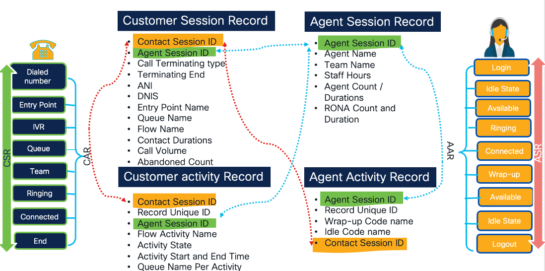
In Webex Contact Center, there are four primary data repositories that store critical customer and agent-related information. These repositories are structured as follows:
-
Customer Activity Record
- Description: This type of record represents individual, atomic steps within the customer’s workflow. It captures key moments in the customer journey, providing insights into their interactions with the contact center.
-
Examples:
- Customer in IVR or queue, talking to an agent, or on hold.
- Customer on specific web pages, such as the home page, product page, or checkout page.
-
Customer Session Record
-
Description: Customer Session Records are more comprehensive, encapsulating the entire customer workflow. They consist of a sequence of customer activities, providing a holistic view of the customer’s engagement with the contact center.
-
Examples:
- Customer calls the contact center for assistance.
- Customer visits a website and explores its content.
- Customer interacts with the website and engages in a chat with an agent.
- Customer initiates contact by sending an email, and an agent responds.
-
-
Agent Activity Record
Description: This record type focuses on individual actions within the agent’s workflow. It logs every significant step an agent takes, shedding light on their interactions and status throughout their workday.
Examples:
- Agent’s status transitions, such as idle, available, talking, or wrapping up.
- Agent’s offline activities, including dialing, note-taking, and reading emails.
- Agent’s involvement in chats with customers and the subsequent wrap-up process.
-
Agent Session Record
Description: Agent Session Records provide a comprehensive overview of an agent’s work. They encompass a sequence of agent activities, offering insights into the agent’s handling of tasks and interactions.
Examples:
- An agent manages a service call, logging an incident or request.
- An agent initiates an outbound call and schedules a meeting for a customer.
- An agent engages in chat interactions with customers, providing answers and assistance.
- An agent reads and responds to customer emails, ensuring effective communication.
These data repositories play a crucial role in capturing, organizing, and analysing the wealth of information generated within the Webex Contact Center, ultimately supporting informed decision-making and enhancing customer and agent experiences.
Before you continue with this exercise follow below:
- Make a Call and select prompted options to get to an agent, with no agent available you would hear a wait music.
- Make sure your agent is logged-in and currently in
Idlestate.
3.1 Create Custom Realtime Agent Report
In this Lab, we will create a custom visualization to showcase the state of agents on a Realtime basis.
Objective: Create an Agent Real-time state report with following data insights:
- State of Agents on real-time basis for Telephony channel.
-
Capture key metrics:
- Agent Team
- Agent Name
- Agent State
- Idle Code
- Total number of agents logged-in
- Number of Agents in Available and idle state for each team
- Duration in the State
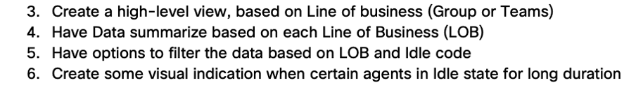
- Create a high-level view, based on line of business (Group or Teams).
- Have Data summarized based on each Line of Business (LOB).
- Have options to filter the data based on LOB and Idle code.
- Create some visual indication when certain agents in Idle state for long duration.
While completing this Exercise, you will be able to understand and use some key capabilities like:
- Fields and Measures
- Enhanced Fields
- Formulas
- Drill-down
- Group Summary
- On the Fly-filter
- Filtering
-
Create a new visualization in Analyzer as an Agent Activity Record.
- Set Start Time as
Realtime. - Set Duration as
None (Snapshot). - Refresh duration as
3 Seconds.
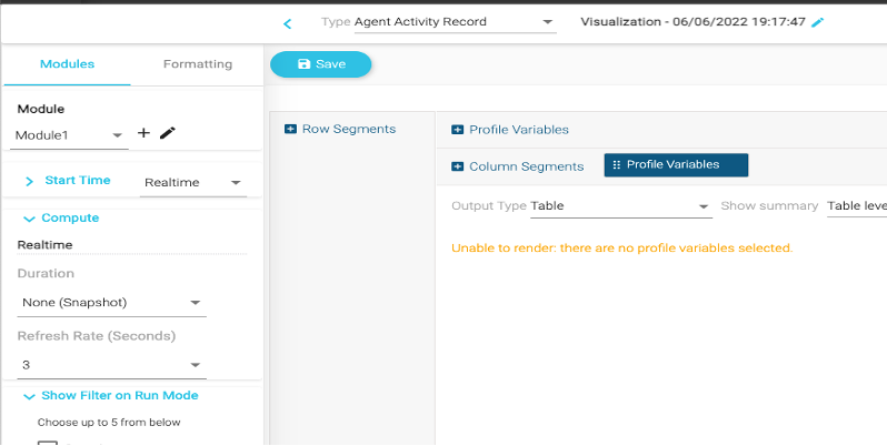
- Set Start Time as
-
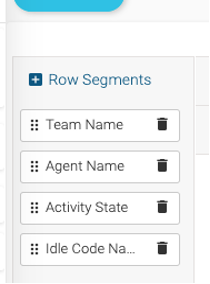
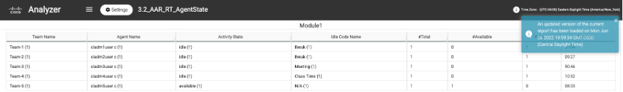
Next, we will begin adding variables to the visualization. Click on Row Segment and add:
- Team Name
- Agent Name
- Activity State
- Idle Code Name
-
Next, click on Profile Variables and add
Agent Session ID (Count)and rename the name as#Total.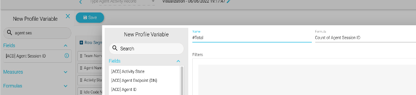
-
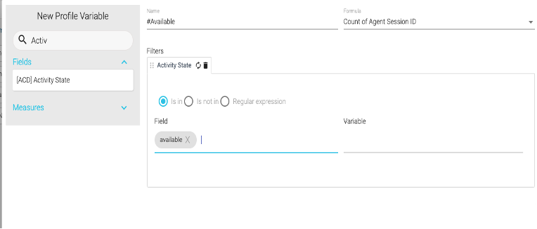
To capture Available Agent Count add
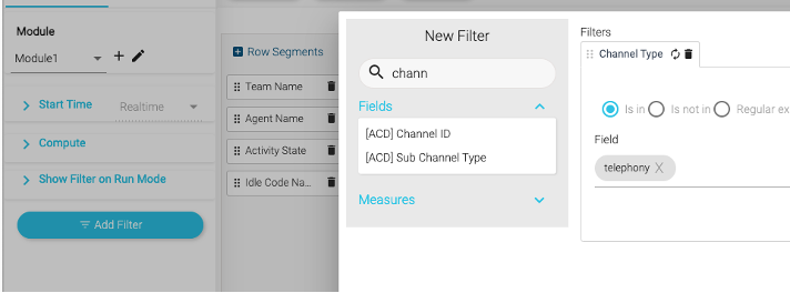
Agent Session ID. Name it as#Available.- Drag
Activity Stateas Filter with valueavailable.
- Drag
-
Repeat step 4 to add Idle Agent Count, this time with filter value
idle. Name it as#Idle.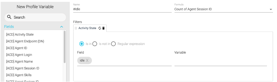
-
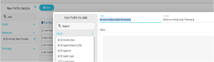
Next, we need to capture the State Duration. We will achieve this by using a formula to subtract the activity start time from current time, which will give us the activity duration.
- Search for Measure Profile variable
Activity Start Timestamp. - Under formula, select
Minimum Activity Start Timestampand save it.
- Right click on the field and click New Formula After, right click on the created field and click on
New Formula.
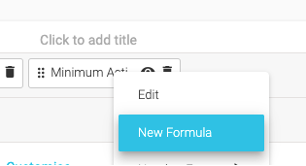
- Name it Duration and swap the fields by clicking
 .
. - Click
 on the empty field and select
 Current Timestamp. - Select
 Subtraction operator, as shown below.
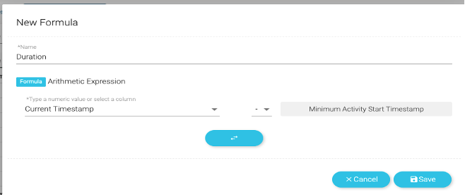 .
. - Right click the
Durationprofile variable, and set the Duration Number Format asDuration > MM:SS.
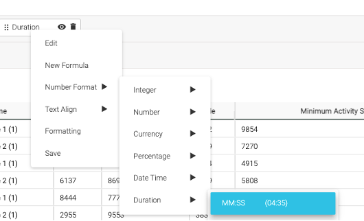 .
. - Hide
Minimum Activity Start Timestampby clicking on the eye icon.
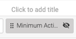 .
.
- Search for Measure Profile variable
-
Re-order the variables by dragging and dropping the variables in the order that you wish to see them in the report.

-
Save the report as
3.1_AAR_RT_AgentState_<YourStudentID>(e.g. 3.1_AAR_RT_AgentState_101) in your folder and clickPreview.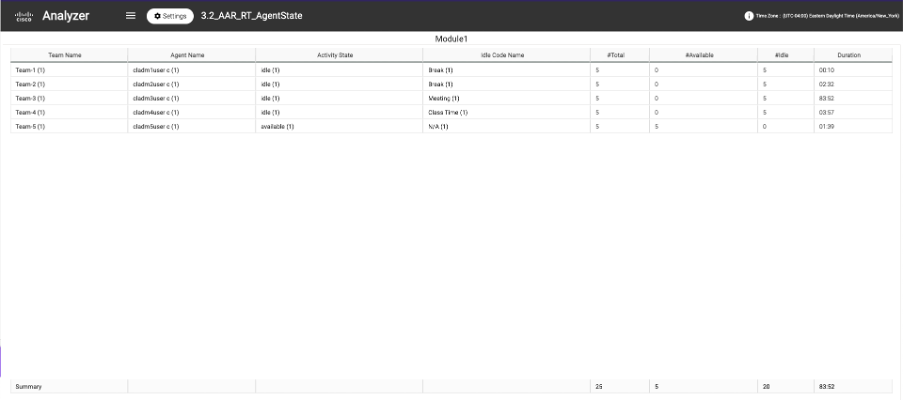
-
Notice that the
#Totalcount for each agent is “10”.- This is because each agent is a multi-channel agent (with Total 10 channels, 1 voice, and 3 Chat, 3 Email, 3 Social ones).
- In this case we want to capture data for
Telephonychannel only so let’s add a Channel Filter for Telephony. - Go Back to the report edit mode and Add Filter with Channel Type as Telephony.
-
Save the visualization and click on
Previewto run it again.
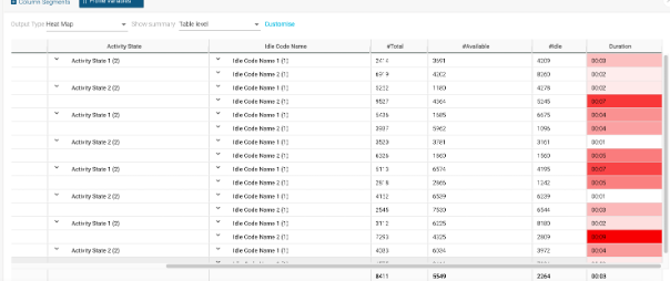
- We are still missing below asks:
- Update the Output Type to
Column Heatmap.
-
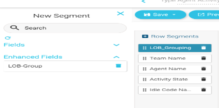
To create a LOB group:
- Right click on the Team name and then
Create Enhanced Field.
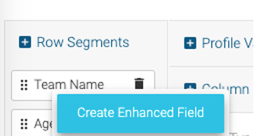
- Name the Field LOB_Grouping, replacing with your provided ID.
Add 2 groups containing the following teams:
CL_G1x : Seach for “Team1” Select from 51_Team1 to 59_Team1
CL_G2x : Seach for “Team2” Select from 51_Team2 to 59_Team2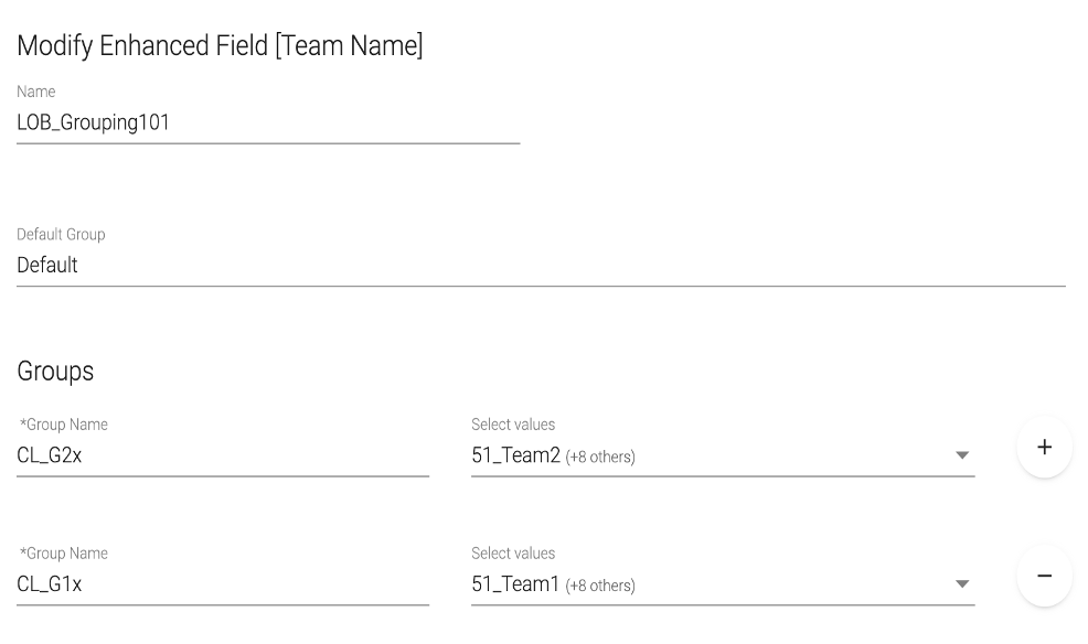
Save it.
-
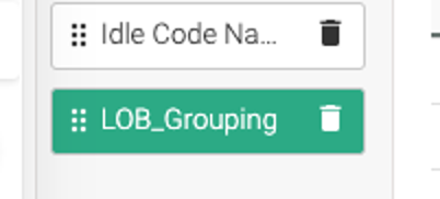
Make this Enhanced Field global so it can be used for any other visualizations with need of creating it again.
Right click LOB_Grouping –> Click Save –> When prompted, click Save again.
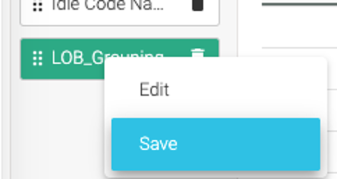
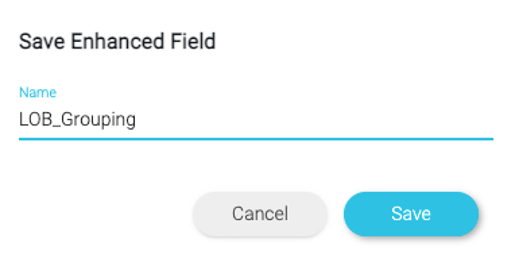
- Field is now saved and can be used in any other report.
- Move LOB_Grouping as top row segment.
- Right click on the Team name and then
-
To create a Summary at LOB level:
- Click
Show SummaryOption and select LOB_Grouping.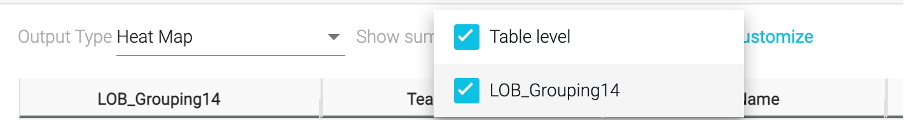
- Click
Customize–> Go to LOB_Grouping level.
- Select
SUMfor #Total, #Idle, #Avaliable –> Save it.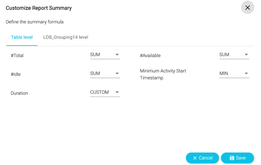
- Click
-
Lastly, add the on-the fly filters for the LOB Grouping and Idle Code Name.
- Click on
Show Filter On Run Mode.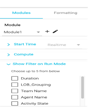
- Select LOB_Grouping and Idle Code Name.
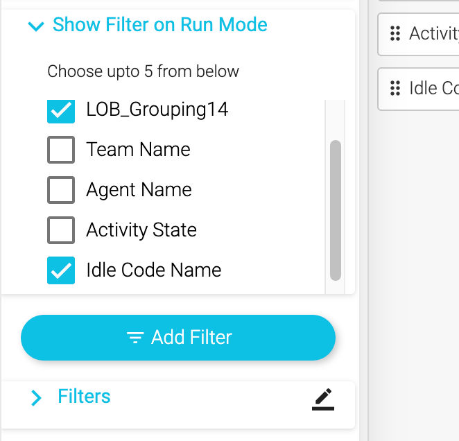
- Click on
-
Save the visualization and check the
Preview.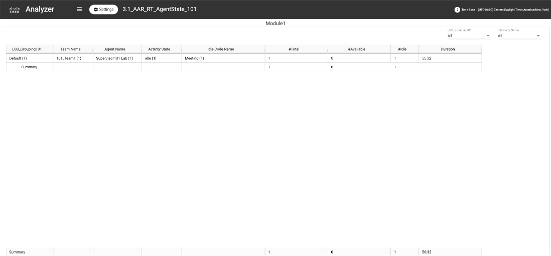
Congratulations, you have completed this lab! You can continue with the next one.
Part 4: (BONUS) Data extraction and scheduling Capabilities
Similar to Lab Part-3, advanced data extraction and scheduling capabilities are not avalaible in New Analyzer UX and are part of the roadmap. Hence, for this exercise, we will use the current Analyzer interface.
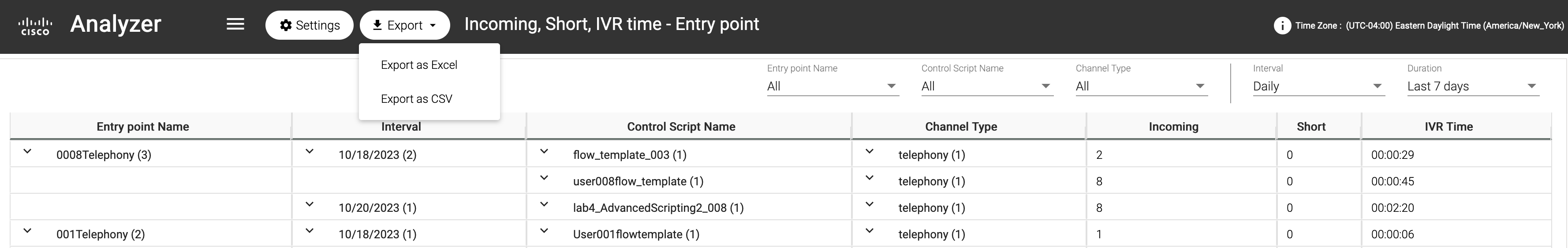
4.1 Export Data as Excel or CSV
Although Analyzer offers a lot of functionalities for users, Contact Center administrators and analysts often need to work with the data offline, modify them via Excel or even share the transformed information with other parties. In this exercise we will see how Analyzer allows users to easily download the report results from within the Analyzer interface.
- Open
Incoming, Short, IVR Time- Entry Pointreport in separate browser tab (or use any other open report in current Analyzer if you prefer). - Click on
Exporton the top and you have the option toExport as ExcelorExport as CSV. Select to export the data as Excel. - File will be downloaded to your computer.
- Now you can use this data offline, perform advanced calculations from Excel or share with your colleagues as needed.
4.2 Visualization Scheduler
In this exercise we will learn how to schedule visualizations within Analyzer. In Analyzer, you can schedule any historical visualization to be run and sent in a predefined time period to an email address. This is very handy for admins or supervisors who need to see reports on a scheduled daily, weekly or monthly basis.
-
Find the report
CSQ All Fields Report.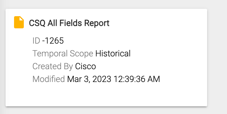
-
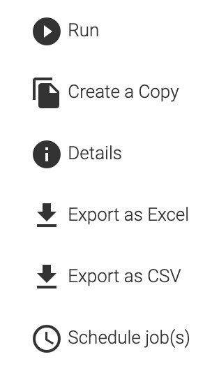
Next, in the right-hand corner of the report, select the three ellipsis and from the dropdown select the option Schedule Job.
-
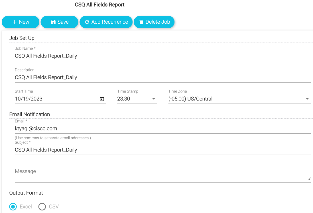
Fill in the schedule information for the scheduled report.
- Start with the Job Name. Let’s set this to run daily so we will give it the name CSQ All Fields Report_Daily.
- Choose a start date and time. Select today’s date with a time of a few minutes ahead of your current time to give it time to trigger.
- Next complete the details for the email notification by entering in your email address and a subject line.
-
Once saved, the scheduled job will show up under the
Jobslist.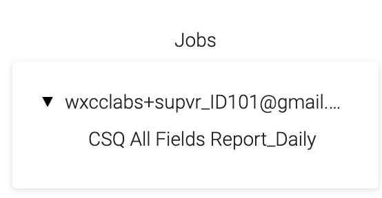
-
If everything was setup correctly, check your email for the report after the trigger time has passed.
- If your job was only set to run once, once it runs, that job is deleted from the jobs list.
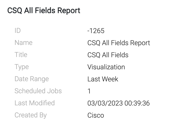
- Close the job scheduling window. Go back to the folder structure and look at the Details of the report, it will show the number of jobs scheduled. You should see 1 scheduled job to reflect the job we just scheduled in this exercise.
4.3 Search APIs
In this exercise, we are going to use the API to retrieve the LastAgentInteraction example from Github to find when a customer called in the last 7 days and which agent they reached.
-
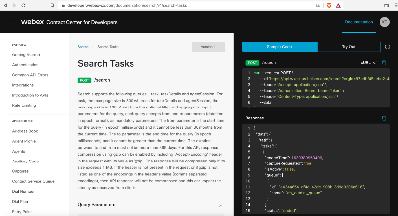
Open Developer portal using this link: https://developer.webex-cx.com/documentation/search/v1/search-tasks
-
Login with your Admin user.
-
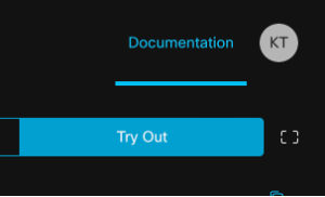
Click Try Out -> Maximize Screen.
-
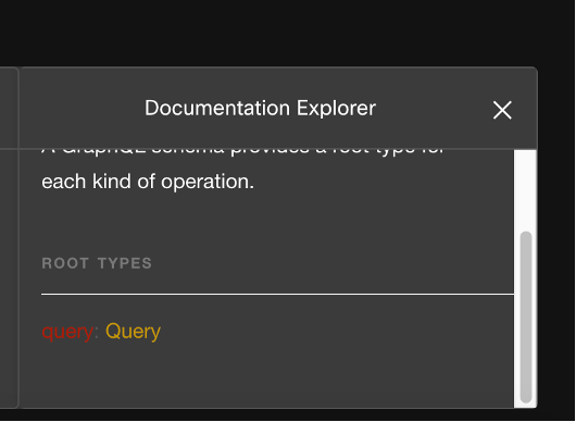
You can explore the schema by clicking on Docs to open the Documentation Explorer. On the explorer, click on Query -> task -> TaskList.
-
Now let’s execute a query and see what data you get. Update the Origin number highlighted in yellow in below query with the phone number you are using to make the test calls.
-
Go to the query window and delete the text first before you paste the new query with your number.
-
Then, paste the snippet in Query space and click Run
 . You should see results similar to the following:
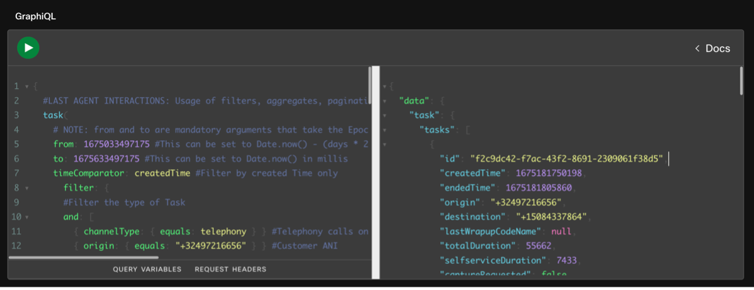
{
  #LAST AGENT INTERACTIONS: Usage of filters, aggregates, pagination and custom fields to find when the customer called last in a 7 day window and who they reached
  task(
    # NOTE: from and to are mandatory arguments that take the Epoch timestamp in milliseconds
    from: 1675638001000 #This can be set to Date.now() - (days * 24 * 60 * 60 * 1000) for lookback in days
    to: 1675782001000 #This can be set to Date.now() in millis
    timeComparator: createdTime #Filter by created Time only
      filter: {
      #Filter the type of Task
      and: [
        { channelType: { equals: telephony } } #Telephony calls only
        { origin: { equals: "XXXXXXXXXXXX" } } #Customer ANI
        { status: { equals: "ended" } } #Final Disposition
        { direction: { equals: "inbound" } } #Inbound call only
        { isActive: { equals: false } } #Resolved call only
        { owner: { notequals: { id: null } } } #Only calls that had an Owner
      ]
    }
    pagination: { cursor: "0" } #Display first page only
  ) {
    tasks {
      #Task Metadata
      id
      createdTime
      endedTime
      origin
      destination
      lastWrapupCodeName #Why the customer called
      totalDuration
      selfserviceDuration
      captureRequested
      #Treatment Details
      lastEntryPoint {
        #Entrypoint Details
        id
        name
      }
      lastQueue {
        #Queue Details
        id
        name
      }
      lastTeam {
        #Team Details
        id
        name
      }
      owner {
        #Agent Details
        name
        id
      }
    }
    #Pagination Information
    pageInfo {
      endCursor
      hasNextPage
    }
  }
}